Raiden
Redesign of user interface for Raiden, an open source project enabling off-chain token transfers for Ethereum.
Overview
I was tasked with redesigning Raiden’s web user interface while I was an intern at Brainbot Technologies for four weeks. Engineers had designed the existing user interface for functionality and testing purposes only and wanted the new interface to be more visually appealing and easier to use. I focused primarily on updating Raiden’s visual design and simplifying the application’s structure by using the existing interface as a wireframe to build on.
Research
My research phase consisted of learning about cryptocurrency and how Raiden works, evaluating the existing user interface, and researching similar products for design inspiration.
Evaluation
I first met with one of the engineers who walked me through the application as if they were a user. I asked questions along the way, taking note of their actions, what features were used or not used, and places they expressed frustration. We discussed my observations, and I got clarification on the unused features to identify which were only present for testing capabilities and which a user might use.
Inspiration
For design inspiration, I searched for other blockchain wallets and dashboard applications using Pinterest. I then put together a mood board that captured the look and feel I wanted the UI to have.
Ideate & Protoype
From my mood board and discussions with the Raiden team, I put together a list of adjectives that described my ideal visual aesthetic for the UI. I kept these words in mind as I began to design the main pages of the application.
First Iteration
I created a wireframe of the existing UI in Adobe Xd to make changes to the structure and user flows. I removed features that were only present for testing and simplified screens to avoid overwhelming the user with extraneous information. With the wireframe updated to make the application more user friendly, I was then able to work on the visual design.
Result
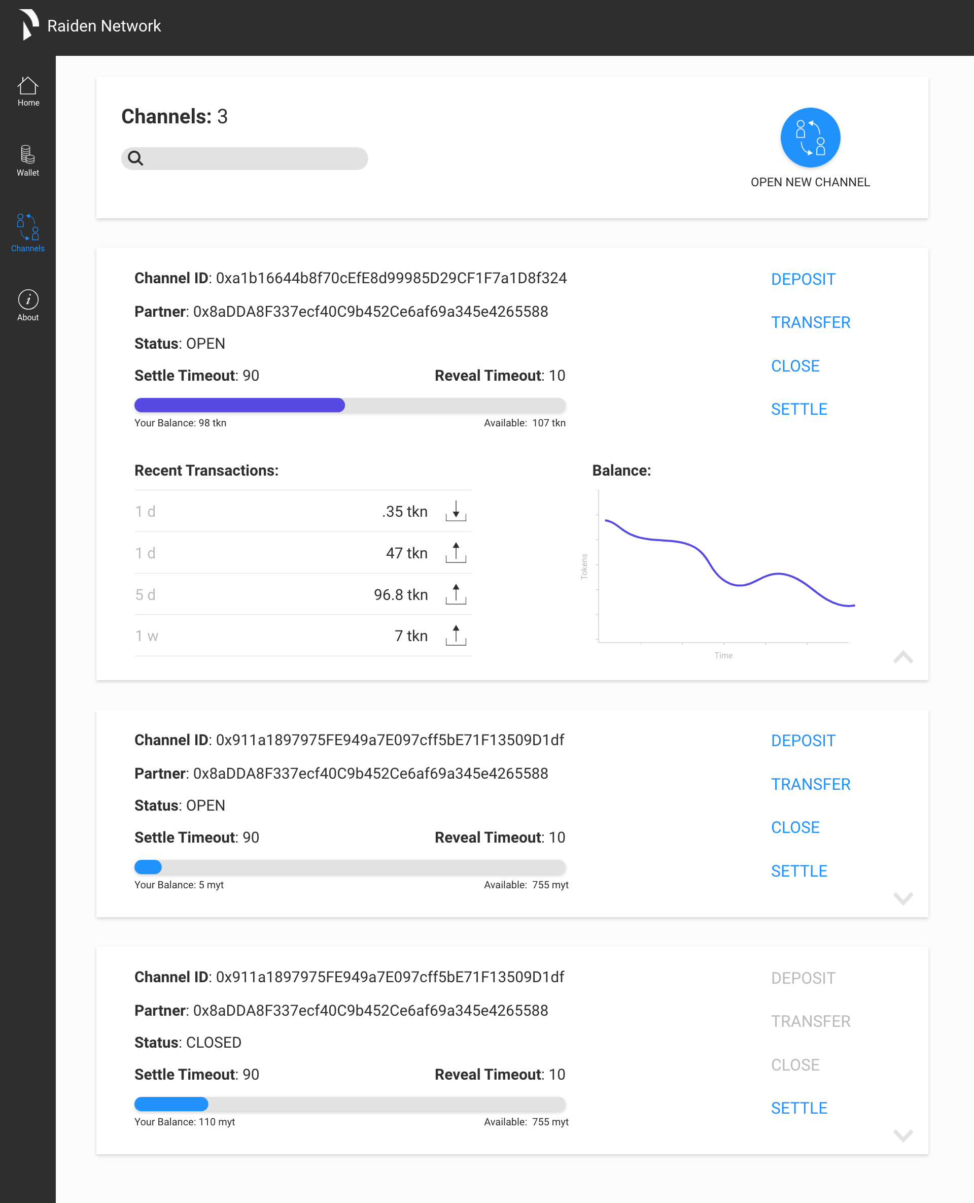
After getting feedback on the first design iteration, I had a better understanding of which features someone would regularly use and which were more advanced and would be used rarely. Resultantly, I moved certain features like registering a new token and opening a channel out of the user’s immediate view. I also added functionality for filtering and sorting tokens and channels.
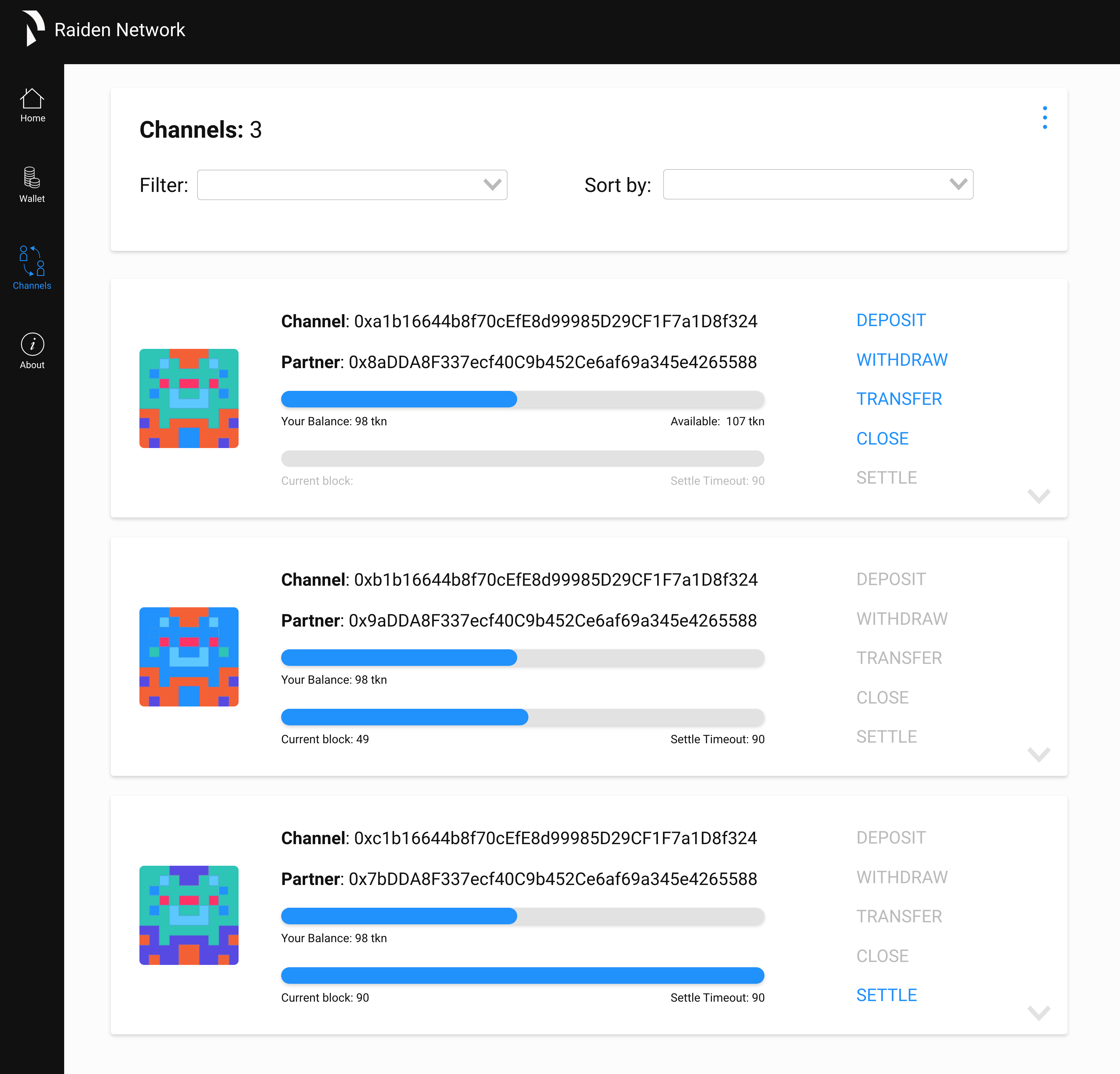
New engineering developments were made, and I updated the design accordingly with the ability to withdraw from a channel. I also incorporated Blockies as a visual identifier for channels and clarified the channel balance labeling to explicitly state whose balance was shown.
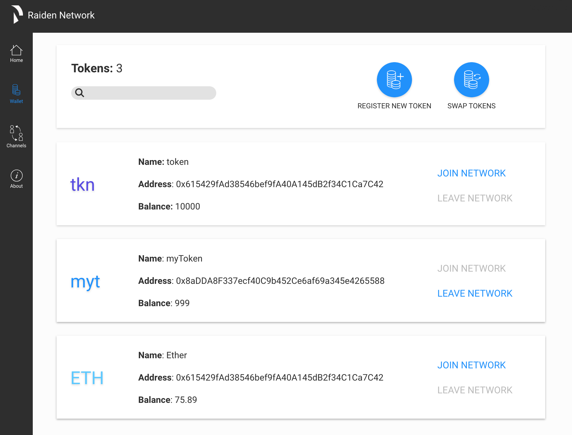
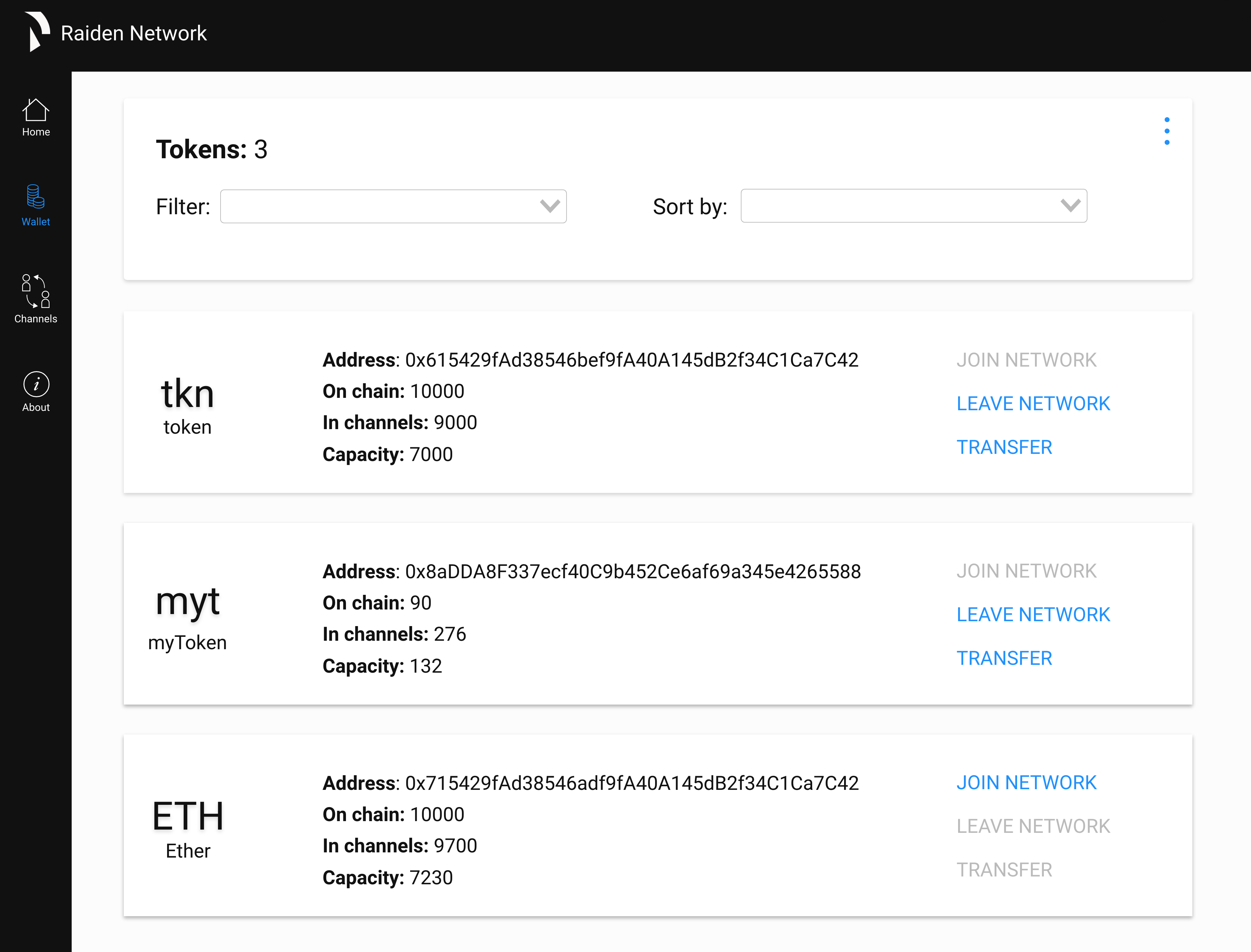
The wallet/tokens page was missing the capability to transfer tokens, so I corrected that in the second iteration.
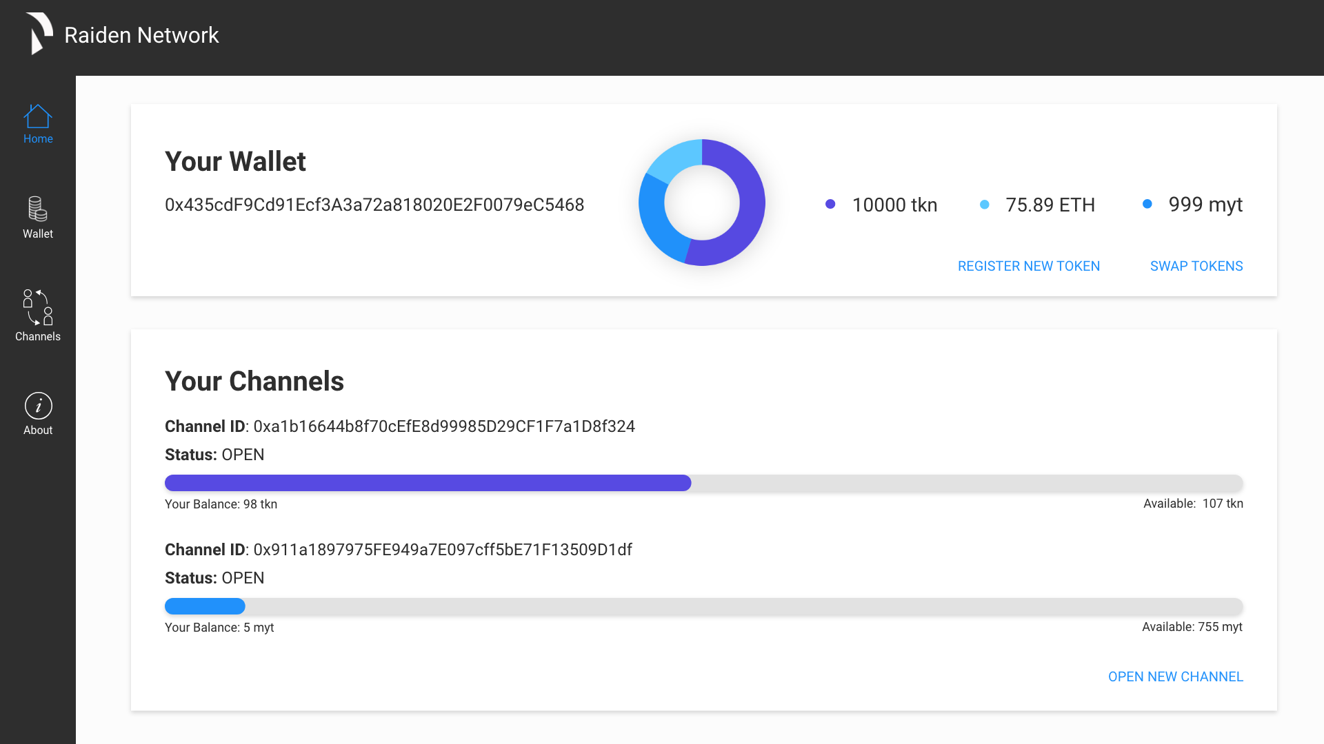
After getting feedback from the engineers, I realized the home page from my first iteration was not necessary for the user. The pie graph I designed did not make sense due to the different relative monetary values different tokens have, and the calls to action didn’t align with the primary use cases. Besides those issues, the rest of the screen was essentially a duplicate channels page.
Implemented Design
While working on this project, I was the only designer on the Raiden team. Shortly after the end of my internship, they hired a designer and frontend developer to finish and implement the new Raiden web-UI.
Here’s a demo of the implemented design:
Final Thoughts
This design project was a challenge because I had to learn a massive amount before I understood Raiden and its uses. A lot of my design mistakes stemmed from my lack of technical knowledge. However, my time with the Raiden team was a great experience because I got to work in a fast-paced startup environment and take full ownership of a project that had a lasting impact after my departure.