Curb
Mobile app design for Curb, a spinning studio franchise for college students.
Overview
Designing the Curb mobile app was my first venture into UX design. The design had a one-week timeline and was the final part of a larger brand design project. Over the week, I conducted user interviews, developed user flow diagrams, a paper prototype, and a low-fidelity wireframe before finalizing the design.
Research
I conducted user interviews with several college students to learn about their current exercise habits and opinions. I organized their answers using an affinity diagram and constructed a few user stories that represented repeated themes.
User Stories
The students expressed a need for an easy way to sign-up and confirm a spot in a class, so they did not have the same frustration of waiting for bikes at their school gym. They also wanted a sense of community and a way to engage with their peers for motivation. Music was also an essential part of their workout experiences.
Ideate & Protoype
With such a short timeline, the goal was to test and get feedback early.
My next step after research was creating a user flow diagram. This helped me visualize the actions a user would need to achieve their goal and helped me figure out the app’s structure and how different sections would fit together. I sketched out a few different options, presented them for feedback, and chose one that felt the most natural.
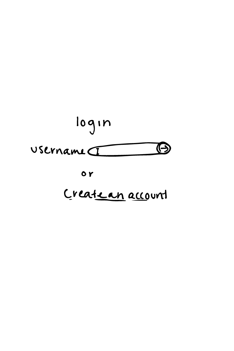
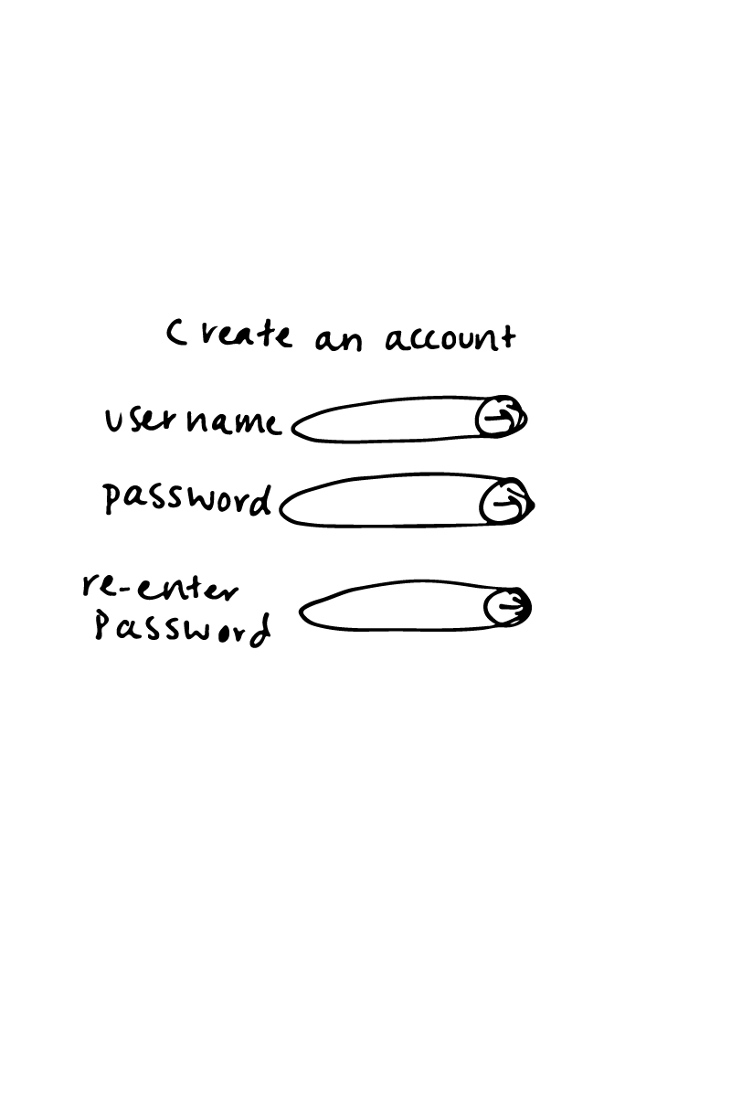
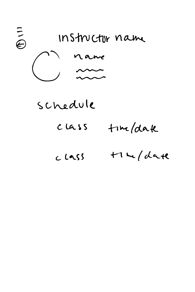
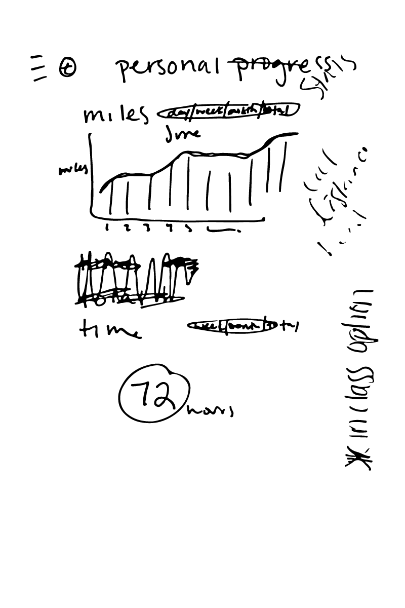
I then began developing a paper prototype. I built on the user flow diagram by sketching the screens associated with each user flow step. The paper prototype saved time and allowed me to have students test an interactive prototype early in the design process.
Paper Prototype
After feedback on this prototype, I discovered that I needed to concentrate more on designing to solve the problems identified by my research phase. While I had formed a better picture of what parts of the app could look like and had tested the main user flows, I had missed the mark on incorporating music and community interaction into the experience. I was glad to have realized this early in the design process.
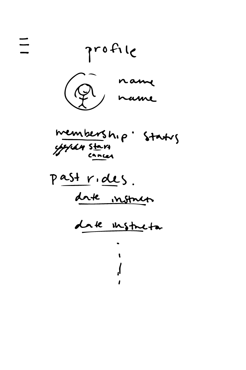
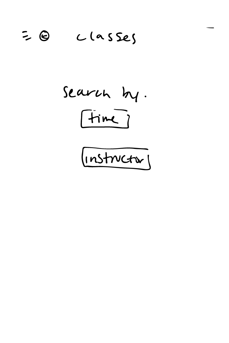
Wireframe
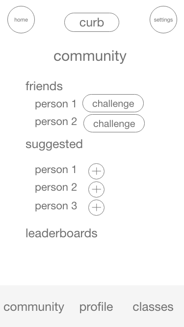
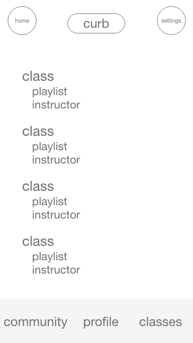
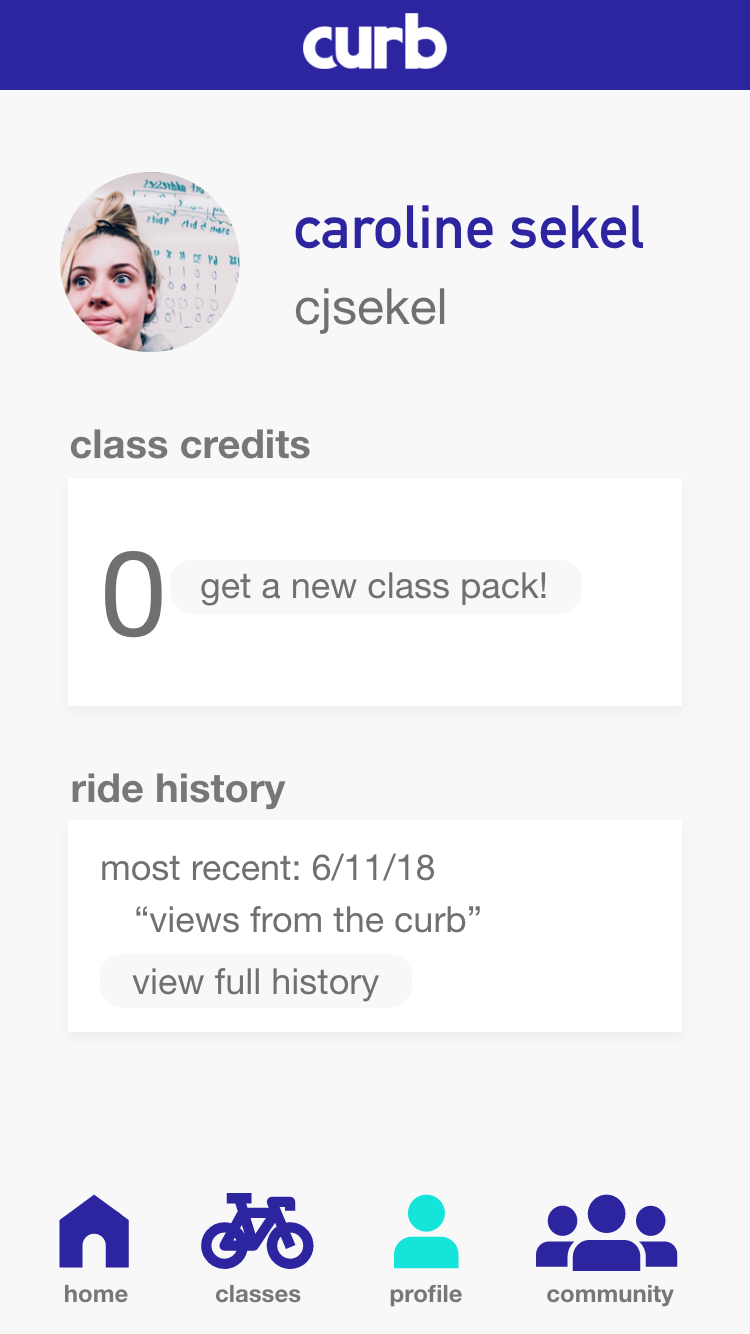
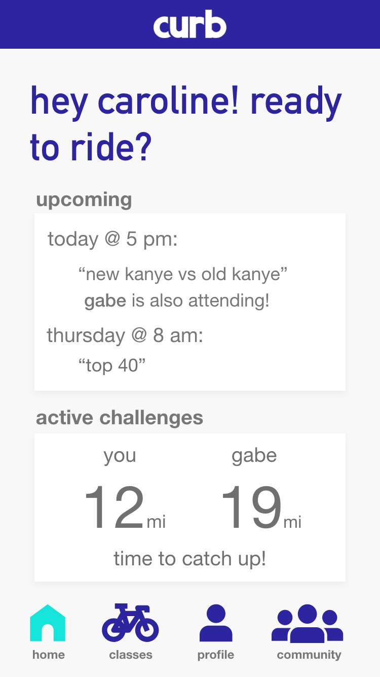
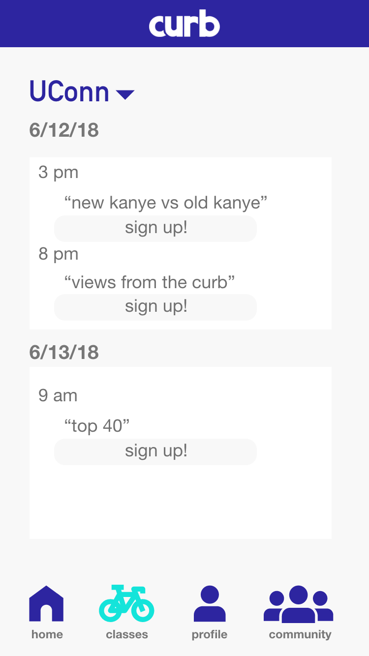
Moving from the paper prototype to the wireframe, I focused more on the app’s music and community aspects. I made class playlists visible so users could sign up for classes that fit their tastes and developed challenges between friends so they could motivate each other. Additionally, I changed the navigation from a hamburger menu to a bottom navigation bar with icons so users could easily access all the app’s main features at any point in their journey.
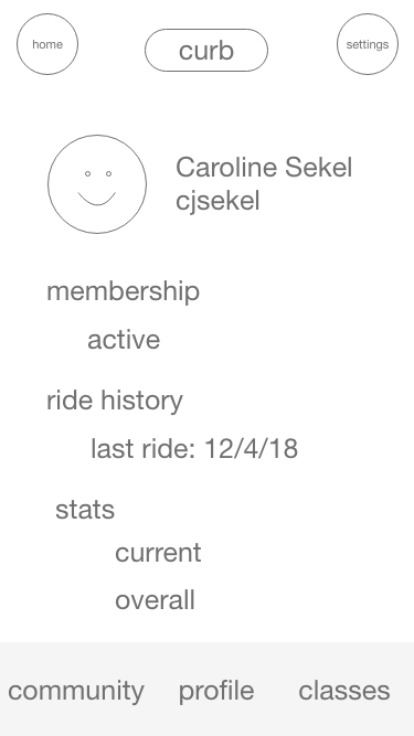
Result
In the final design, class names are their playlist titles and students can see which of their friends are attending their upcoming classes and challenge them.
Final Thoughts
Looking back, from a visual design perspective, the final design could use some polishing. Still, this project was an impressive introduction to UX design, and I learned an incredible amount in such a short period.
If I had more time to complete this project, I would have gotten additional feedback on my high-fidelity wireframes to flesh out all of the pages. I also wanted to solidify the concept of challenges to ensure that the challenges were light-hearted and motivational and that competition did not become a negative aspect of the Curb culture.